About Diagrams: (About Diagrammatical Thinking)
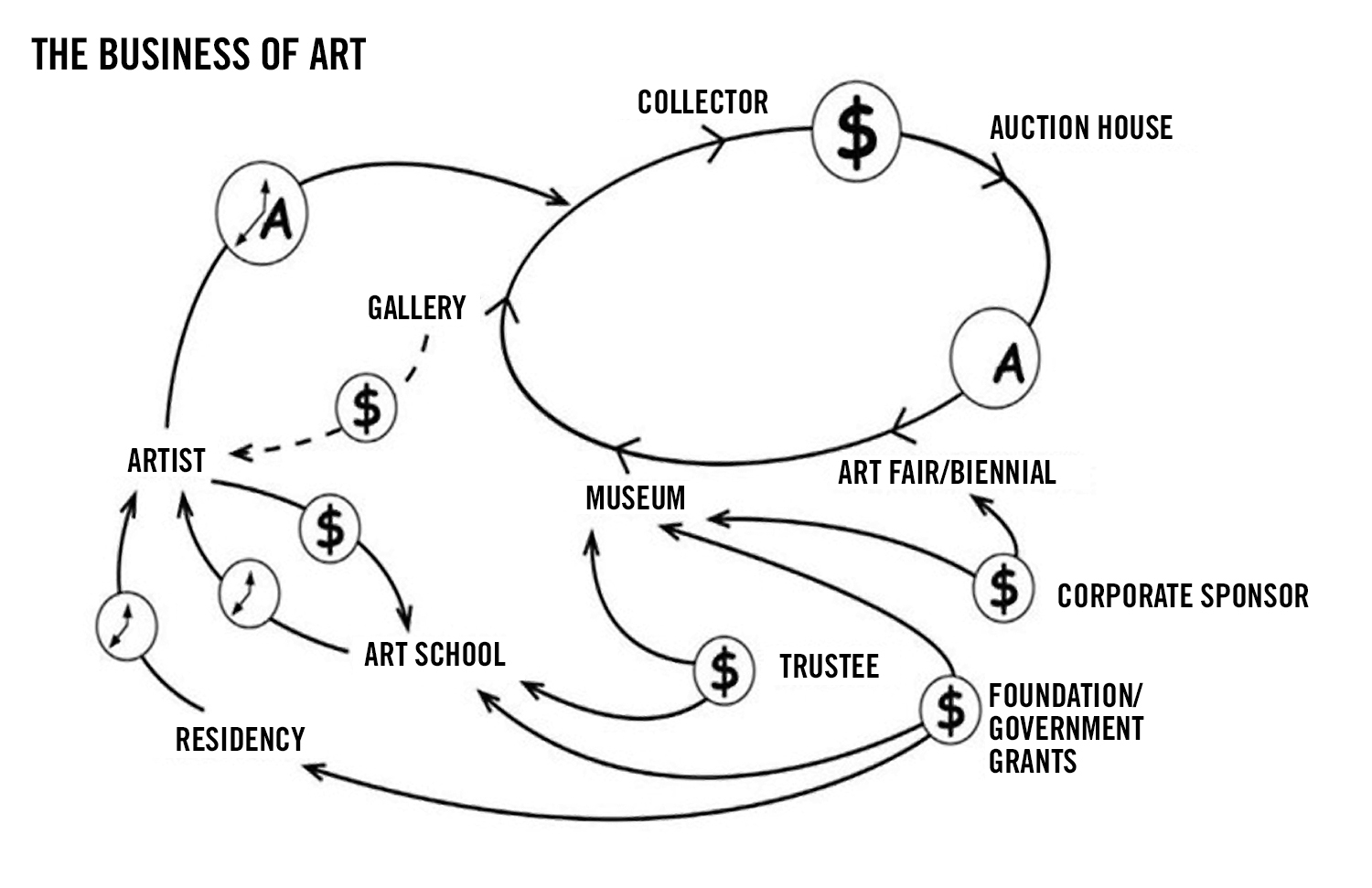
Figure 1: The Business of Art, Lize Mogel
In this ongoing project, The Expanded Diagram, I am making the argument that, for some artists, diagrammatic thinking aptly describes a significant aspect of their creative process—more cogently than the boatloads of art labels and art categories currently on offer. I am not claiming that all or even the majority of these artworks look like conventional diagrams, but rather that the way these artists think about and develop their artwork mirrors critical features of diagrammatic processes. But before we begin to connect diagrams with artworks, we need to understand what diagrams actually are, and more crucially, what we mean by diagrammatic thinking.
What follows is only a cursory overview of the long history and evolution of diagrams. I wish to begin by acknowledging that I have drawn from numerous sources in my quest to understand diagrams in general and to distinguish diagrammatical thinking from other modes of representing thoughts, feelings, and processes. I urge anyone interested in taking a deeper dive into this subject to go directly to these sources listed in the bibliography.
Delving into the history of diagrams, I was struck by how many ways they can be defined or described, as they have been used for such varied purposes in a wide range of knowledge domains. For example, we are “diagramming” whenever we scribble a few lines and notations on a sheet of paper to give directions. Diagrams are regularly deployed in both the making of and the analysis of artworks and literature. From the ancient Greeks onward, diagrams have served as an important component in the exposition of highly abstract mathematical calculations. Certainly since the latter 18th century we have witnessed an explosion of diagrams in response to the rapid advances of technology and scientific discoveries that began to outstrip the human senses and their ability to grasp ever higher levels of complexity. Diagrams have stepped into the breach where the descriptive capacities of conventional language and pictures have proven woefully insufficient. And now we find ourselves full on into the information age where we are inundated with diagrammatic displays, as even a brief swipe through a stocks app will make abundantly clear. I would even argue that the diagram’s very structure of knowledge and perception has become a privileged mode of visualizing the networked life world of the modern era.

Figure 2: Line graph: William Playfair’s Commercial and Political Atlas and Statistical Breviary, 1786
At the outset, I feel it is important to disentangle the term, diagram, from the plethora of graphical forms used throughout multiple domains for information visualization and analysis. Just to name a few, there are diagrams, maps, architectural plans, scatter plots, calendars, graphs, tables, timelines, schematics, network diagrams, bar charts, pie charts, flow charts, Venn diagrams, genealogical trees, trees of knowledge, Portolano charts, area-based visualizations, topic maps, node-link diagrams, web, lattice and matrix formats, spatial projections, directed graphs, docubursts, and so many more. A few of these graphical forms go back many centuries and many are of much more recent origin. But for the purposes of this project, any of these graphical structures might or might not be considered a diagram, depending on how it is used. It is important not to get bogged down trying to tease out the formal and functional distinctions of these various formats, but rather to settle on just one, far more fundamental distinction—the distinction between those graphical structures that merely display information and those that prompt active interactions with the information from the user/viewer. For the purposes of this project—The Expanded Diagram—the diagrammatical inheres in any format (whatever it might be called) that is a site of ongoing knowledge production. A diagram is not merely a “representation of knowledge” but rather a “knowledge generator.” [See Figures 3 & 4 (Drucker, 65)]. This performative quality of diagrams will prove crucial to our understanding of diagrammatic thinking in art.

The image on the left (Figure 3: Map of the Internet circa 2008, Barrett Lyon and The Opte Project) merely displays information, whereas the image on the right (Figure 4: The Great Art of Knowing, Athanasius Kircher, 1699) generates information. It produces the knowledge it draws. (Johanna Drucker: Graphesis: Visual Forms of Knowledge Production)
A (very) Brief History of Diagrams
For a more comprehensive survey of the history of diagrams, I would refer you to other sources in the bibliography. But before delving further into defining the critical features of diagrams and diagrammatic processes, it would be helpful to sample a few notable instances in human history of diagrammatic thinking. With all of the following examples, despite their varied cultural and historical contexts and their diverse materials, surfaces, marks, and notations, each presents a predominantly abstract (non-pictorial), graphical scheme that generates meaningful relations of “information” through their spatial (non-linguistic/non-linear) organization. Although many diagrammatic displays may include texts and/or pictures, it is important to see these as mere components of a larger spatially related whole. “Diagrammatic images spatialize relations in a meaningful way. They make spatial relations [e.g. simultaneity, hierarchy, juxtaposition, proximity, alignment, connectedness & disconnectedness] meaningful.” (Drucker: 66)

Figure 5: Babylonian mathematical calculation (1900 -1700 BCE)
Figure 6: Marshall Islands sailing chart
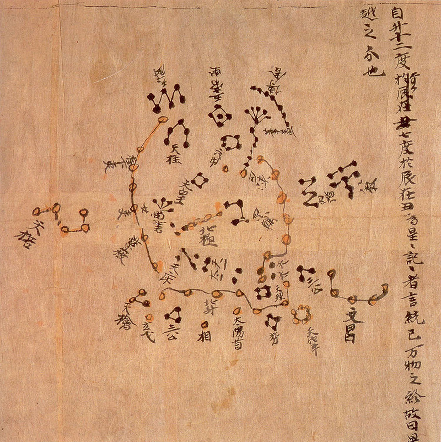
Figure 7: Dunhuang Star Map (detail), Tang Dynasty (618–907)

Figure 8: The Carta Pisana, a portolano chart. End of 13th century (detail)

Figure 9: Phases of the Moon: Abu al-Rayhan Muhammad ibn Ahmad al Biruni (Iranian, 973-1048)

Figure 10: Mandala of Jnanadakini, Tibet late 14th century
What are Diagrams?
(and what makes them different from “pure” writing and images?)
I will not even attempt to offer a single, conclusive definition of diagrams, as I am sure that anyone who does would be subjected to numerous counter arguments and endless categorical slicing and dicing. So I will begin with a couple of “official” definitions and, with the help of a several other thinkers who have thought about this a lot more than myself. I will break this down to six fundamental qualities of diagrams that illuminate how they function and their distinctive place in the history of graphic visualization.
Let’s begin with Merriam-Webster’s definition of diagram: 1. A graphic design that explains rather than represents; especially: a drawing that shows arrangement and relations (as of parts). 2. A line drawing made for mathematical or scientific purposes.
And to that, lets add the OED definition: Diagrams are used to represent symbolically the course or results of any action or process, or the variations that characterize it.
Elsewhere I quoted James Elkins who referred to the diagram as the “forgotten third in the triad writing-image-diagram.” (Bender’s and Marrinan: cover jacket) The first two of these representational modes are fundamentally different from each other—writing describes; images depict. Diagrams, on the other hand, are often composed of both text and images along with abstract symbols and notations, but they operate according to very different principles. Nelson Goodman distinguished depictions (pictures) from descriptions (oral and written language) by characterizing the former as informationally “dense,” seemingly instantaneous, indivisible and whole, whereas the components of writing are discontinuous and presented to the reader or listener in a linear temporal order. (Goodman 1968)

Figure 11: Dublin, Ireland town plan: Patrick Abercrombie, Sydney A. Kelly and Arthur J. Kelly, (1916)
So what are those different operating principles that distinguish diagrams from pure depiction or pure description? Bender’s and Marrinan, in their Culture of Diagram, characterize the classic diagrammatic amalgam of depictions and descriptions as a space facilitating the “convergence of dissimilar data” presented to the viewer to be “correlated in an explicitly process-oriented array.” (Bender’s and Marrinan, 2010) Thus diagrams function not so much as representations of the world but rather as what they call “working objects” where various modes of “data” can be correlated, manipulated, and cross-referenced. And what enables or prompts the viewer’s active engagement with the diagram is the presence of what the authors refer to as “white space.” Here they are referring to a relatively neutral blank ground in and around the images, words, symbols or notations. It is the strategic presence of the white space that prompts the viewer to focus less on the individual components, but instead to extract meaning by actively correlating one “packet of information” with another so as to conjure new and unexpected relationships.(Bender’s and Marrinan 2010) Echoing this “process-oriented” principle of diagrams, the semiotician Frederik Stjernfelt, describes diagrams as “signs that may be manipulated in order to display new information not explicitly present.” (Stjernfelt 2007) (See Figure 12)
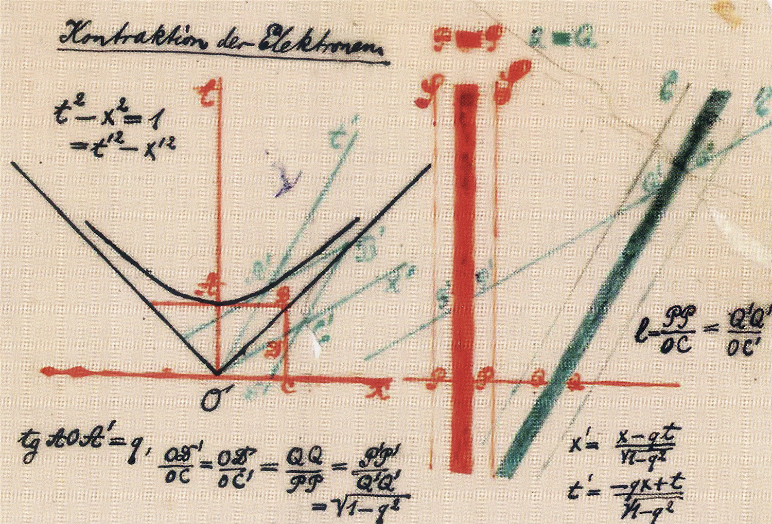
Figure 12: Spacetime Mathematical Diagram. Hermann Minkowski (1908)
At this point we can discern a few general qualities that are often (but not necessarily) associated with diagrams and diagrammatic thinking by examining more closely what I have condensed into six broad characteristics. The first four address the functionality of diagrams (how diagrams work), whereas the last two highlight their emergence as distinctive modes of visualization in early modern western culture.
1: Interactive/Performative
2: White Space
3: More Than What the Eye Can See
4: Explains Rather Than Represents
5: Statistics and the Domination of the Contingent
6: Escaping Alberti’s “Spatial Box”
Interactive/Performative: One of diagrams’ more universal and distinctive qualities is that they prompt active engagement of the viewer with the diagram in a different way than with pictures and descriptive writing (see “white space” below). You might say that, despite their real world existence as artefacts, diagrams aspire to be more like verbs than nouns. Diagrams become fully diagrams not as static visual displays but rather as they are being actively engaged and “worked” on (or as David Joselit describes this in his article, Dada’s Diagrams, actively “piloted.” (Joselit , 2005). We know this to be especially the case with various classes of diagrams such as maps and architectural plans whose entire purpose is to facilitate interactivity with its users. (Figure 13) These prompt the viewers to mentally “move” around in these decidedly abstract spaces but in a fundamentally different and more expansive way than with either a pictorial rendering of space or even in bodily, real time experience.

Figure 13: Philadelphia City Hall
White Space: Certainly viewers, listeners and readers might actively engage with depictions and descriptions, but they do so in fundamentally different ways. The key difference lies in the use of “white space” so essential to most diagrams. The authors of the Culture of Diagram initially used this term when referring to the white paper upon which was printed the many diagrams of Diderot’s 18th century Encyclopedia. (Bender and Marrinan, 2010) (See figure 14) But going forward, white space will stand for any relatively blank interstice deployed between the “positive” elements of a diagrammatic display. These can just as well be referred to as negative space, interstitial space, intervals, blank space or even a “virtual whiteness” of mathematical space. Regardless of whether or not it is actually white, the primary function of white space is to enable and to prompt the viewer’s correlative interactions among the diagram’s depictions, descriptions, symbols or notations. Conventional pictures do not contain within their borders truly blank space. For example, much Far East Asian painting contains significant expanses of open, relatively unmarked surfaces, but these areas of the painting are never conceived as blank, as some kind of zero degree space; rather, these open areas are highly suggestive of a continuous pictorial space (see figure 15). Similarly with writing: the white space—the gaps—between letters and words that you see here function as organizational devices critical to their temporal, ordinal presentation. Edward Tufte, a foremost expert on information graphics, recommends to designers of diagrams to “remove as much visible weight as possible from the display and playing up the eloquence of empty space.” (Tufte 1990: Envisioning Information) In a later writing I will distinguish diagrammatic “white space” from the relative blankness (absence of incident) of the surfaces much contemporary reductive abstract painting. For example, with most monochrome paintings, the relative absence of discrete marks along with their almost total evacuation of pictorial space and any noticeable figure/ground relationships is likely intended to emphasize the “objectness” of the surface in real space (see figure 16). This is not the case for diagrams. Here the enveloping fields of “white” serve simultaneously to bind and to separate the disparate components of the layout.

Figure 14: Diderot’s Encyclopedia, 1763
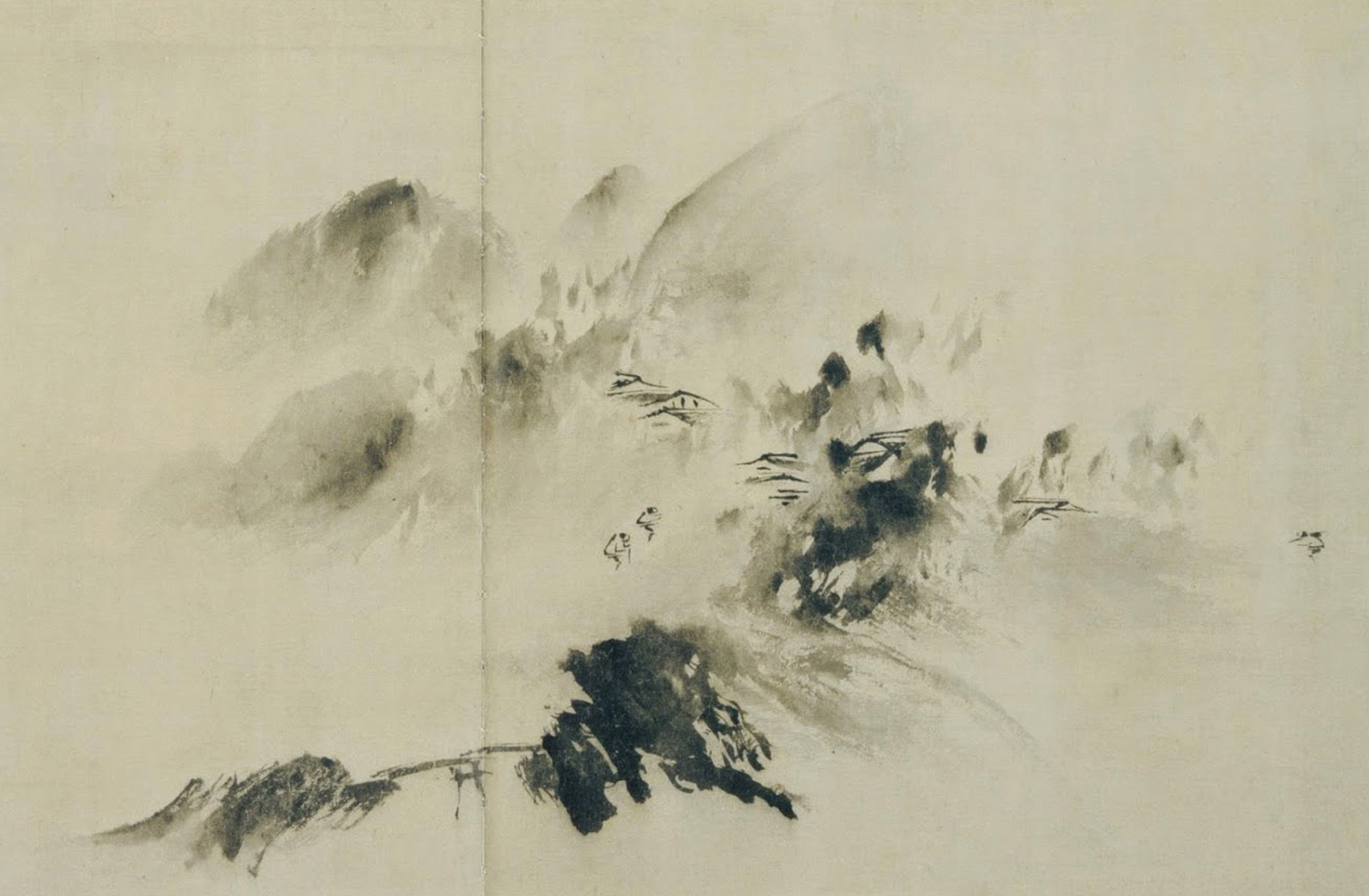
Figure 15; Mountain Village in Clearing Mist, Yu Jian, 1220

Figure 16: Stephen Prina: Monochrome Paintings
More Than What the Eye Can See: The viewer extracts information “not explicitly present” (Stjernfelt, 2007) from diagrams in fundamentally different ways than they do with (non-poetic) writing and pictures. Certainly pictures and texts may describe, point to, represent, refer to, or prompt, for the viewer’s imagination, objects and ideas that are literally not present on the page; but these are fundamentally different processes than are experienced by the viewers of diagrammatic arrays. With diagrams, the “users” are prompted to correlate and to cross-reference any number of relationships lying latent and not explicitly present on the page. Connecting diagrammatical thinking and artworks, Frederik Stjernfelt, in his Diagrammatology, explains that “Frank Stella’s famous ‘what you see is what you see’ only remains correct in a diagrammatical light, if ‘see’ is taken in a broad sense including more than vision proper—namely logical and conceptual insights. Seen as a diagram, the picture is a machine a penser, allowing for a spectrum of different manipulations. It is these manipulations the analysis of pictures (diagrams) must reveal, and they are not immediately visible in one glance on the canvas.” (Stjernfelt, 2007: 288)
Additionally, you can say that diagrams are to science what religious artworks are to theology: both address a persistent human craving to visualize that which cannot be seen. Two wildly different instances of this would be the divine visualized through icons and the quanta visualized through diagrams. (See figures 17 and 18)

Figure 17: The Baptism: Icon, Crete,

Figure 18: Feynman Diagram: Richard Feynman
Explains Rather Than Represents: Here I’m lifting directly from the above quoted Merriam-Webster’s definition, as I feel this signals one of several possible distinctions of diagrams and diagrammatic thinking from much written and certainly the majority of pictorial modes of communication. Clearly a lot of writing is used to explain rather than to represent something (or to describe, to convince, to command, etc.), but a great deal of writing—especially fictive writing—mostly re-presents an extrinsic real or imaginary scene or occurrence. Specifically with visual domains, I would claim that most conventional pictorial modes are tasked almost entirely with re-presenting something. For example, a picture of an apple is a representation of an actual apple in an artist’s studio or of that artist’s mental image of an apple. Diagrams, to various extents, may incorporate pictures, but here they function as components of a larger visual array tasked with explaining something, often aiding the viewer’s understanding of processes and relationships. (See figures 19 and 20)
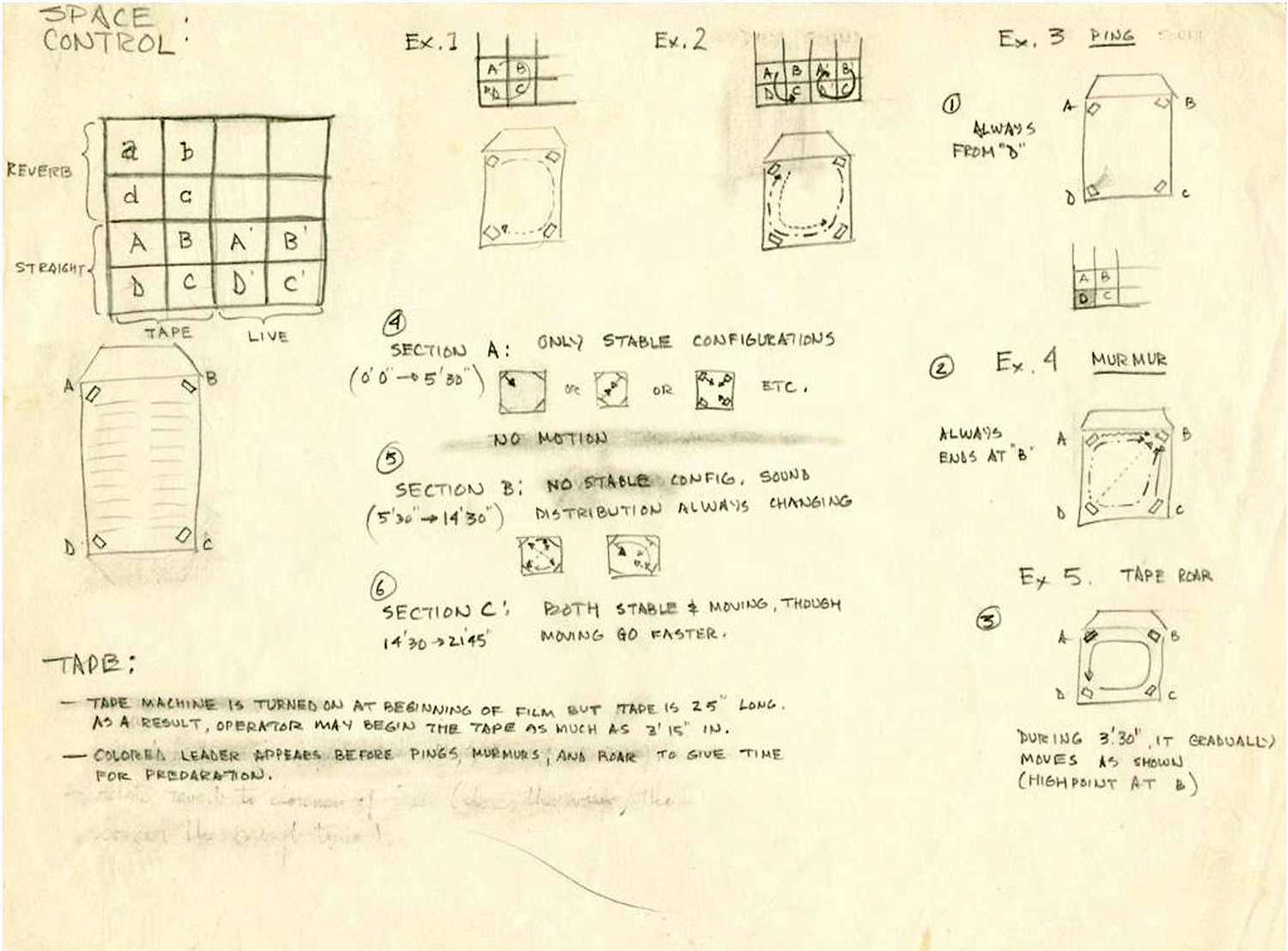
Figure 19: Storyboard: Roger Reynolds

Figure 20: Diagram explaining different “station point” perspectives from different cultural traditions
Statistics and the Domination of the Contingent: Certainly the meteoric rise of the number and use of diagrams in the 19th century had a lot to do with diagrams’ association with statistics. We cannot underestimate the profound impact of statistical analysis on modern epistemology itself (how the world is known) and how it steadily displaced the “narrow bandwidth of the human senses and descriptive abilities.” (Bender and Marrinan, 2010) Already in the mid 19th century, the life world in many regions in Europe and North America were being rapidly transformed by large scale industrialization, unprecedented movements of populations, and urbanization which prompted an ever-increasing need to bring order and predictability to so many areas of society. Into this breach, numerous fields of knowledge stepped in (if not actually being created in at this very moment) such as sociology, criminology, psychology, physics, economics, meteorology, business management, and more. Practitioners in all of these long-established or burgeoning fields of knowledge and praxis turned to statistical methodology to discern and ultimately to control the unpredictability of the social and the physical environment. Of course, this was all a part of the ongoing expansion of the scientific domain that was tasked to control all manner of seemingly unquantifiable phenomena by establishing predictable norms and regularities beyond the caprice of random individual variances. From everything we have covered so far, we know that diagrams and diagrammatic thinking offered new formulas of presentation facilitating more effective means not only to display statistics but to actively analyze them. But aside from establishing this crucial historic connection between statistics and diagrams, the more philosophical takeaway here is diagrams’ critical role in managing our anxieties about uncertainty, randomness and the profound unknowability of the future. Mathematics—especially calculus and probability—displaced the human senses as the primary vehicles for converting ever-expanding data sets to a workable mastery of the contingent world. (Bender and Marrinan, 2010) (See figures 21 and 22) As it is, I only have to launch the Stocks or the Weather apps on my phone to remind myself of this critical (both practical and psychological) role of diagrams in “managing” modern life. [On this matter, I am also indebted to the work of Mary Ann Doane, especially her excellent book, The Emergence of Cinematic Time: Modernity, Contingency, The Archive.]

Figure 21: Linear Chronology, Exhibiting the Revenues, Expenditure, Debt, Price of Stocks & Bread, from 1770 to 1824. W. B. Whittaker, 1824

Figure 22: Counting Crimes or Counting People: Some Implications of Mid-nineteenth Century British Police Returns, Chris A. Williams, 2000
Escaping Alberti’s “Spatial Box:” Starting in the late 18th century, diagrams began to challenge and circumnavigate what had been in the West (and continuing to this day in our photo saturated environment) the dominant structure of pictorial space characterized by Stjernfelt as the “spatial box.” (Stjernfelt, 2007) Although variations of this way of picturing space go back in the West to classical Greek and Roman painting (and, to a certain extent, with Far East Asian painting), its modern formulations began in the 15th century, notably with the writings of Alberti with what is generally understood as linear perspective. Baked into the visual logic of the spatial box is a bounded, self-contained fragment of virtual space—a tableau—anchored to a frozen “station point” of a single viewer. (see figure 23) It is entirely understandable as to why the “spatial box” would underwrite the dominant “visual regime” (Jay 1993) in the West and eventually across the planet, as it so effectively mimics the way human eyes actually see—that is, the actual process by which the human eye/brain perceives and processes the countless incoming rays of light bouncing off the surfaces of its surrounding environment. A similar simulation of this process occurs with photography, which is why we generally associate photographic re-presentations of space with higher orders of the real (“looks more realistic”). For a much more detailed explanation of the development of linear perspective and other spatial “projection” systems of other cultures, see my Components of Pictorial Space.
However, the main point for this discussion is that, beginning in the late 18th century, diagrammatic displays began to challenge the dominance of the long established pictorial order by presenting radical alternatives to the protocols of mimesis. Rather than legislating a single viewpoint of a replete, self-contained fragment of space, the diagram presented arrays of multiple, discontinuous points of view and multiple modes of visualization. The older spatial unities of tableaux were riven by the inclusion of temporal relations among its parts. Crucially the presence of white/blank space required a new kind of “decoding” according to diagrammatic protocols; this required from the viewer the sustained cognitive effort of correlation. Competing with more traditional pictorial representations of space were venues supporting more correlative (diagrammatic) processes that, I would argue, set the stage for Cubism, Dada, Constructivism and other artistic “revolutions” of the early 20th century. (See figures 24, 25, and 26)

Figure 23: Ideal City, Francesco di Giorgio Martini, 1490-91

Figure 24: Fruit Dish and Glass, Georges Braque (1912)

Figure 25: Beat the Whites with Red Wedge, El Lissitzky (1919)

Figure 26: Dame! Francis Picabia, 1920
In Conclusion: I have attempted here to condense an enormous amount of material about the history and functions of diagrams. My primary objective was to tease out what I feel are their essential qualities so as to lay the groundwork for further investigations on how diagrammatic thinking intersects with art. (see Diagrams and Art).
IMAGES
Figure 1
The Business of Art, Lize Mogel
https://jillthayer.files.wordpress.com/2015/10/lize-mogel_two-diagrams_the-busines-of-art1.jpg
Figure 2
Line graph from: William Playfair’s Commercial and Political Atlas and Statistical Breviary, 1786 (Cambridge University Press, 2005). Playfair invented several kinds of charts and graphs. He believed that graphs were a better way to convey numbers than tables. https://no.wikipedia.org/wiki/William_Playfair#/media/File:Playfair_TimeSeries-2.png
Figure 3
Map of the Internet circa 2008. Barrett Lyon and The Opte Project. https://torontocreatives.com/graphic-design/mapping-the-internet/
Figure 4
The Great Art of Knowing, Athanasius Kircher (1699)
https://www.are.na/block/1332602
Figure 5
Babylonian mathematical calculation inscribed on fired clay tablet (1900 -1700 BCE) Yale Peabody Museum of Natural History. https-//www.pinterest.com/pin/528961918703465257/?lp=true
Figure 6
Marshall Islands Sailing Chart made of sticks that represent currents and shells that represent islands, tied with palm fibre. From the Cambridge University Library’s Special Collections Division.Image from: http://bravethewoods.com/marshall-islands-sailing-charts/
Figure 7
Dunhuang Star Map (Detail): Tang Dynasty (618–907) This is one of the first known graphical representations of stars from ancient Chinese astronomy. The International Dunhuang Project (IDP), Directorate at the British Library, London, England https://commons.wikimedia.org/wiki/File:Dunhuang_star_map.jpg
Figure 8
(Detail) The Carta Pisana is a Portolano chart made at the end of the 13th century, about 1275-1300. These charts focused solely on information important to navigating along coastlines eschewing any information
about inland geography and topography. https://en.wikipedia.org/wiki/Carta_Pisana#/media/File:Carta_Pisana.png
Figure 9
Phases of the Moon: Abu al-Rayhan Muhammad ibn Ahmad al Biruni (Iranian, CE 973-1048) From his Book of Instruction on the Principles of Art and Astrology. https://upload.wikimedia.org/wikipedia/commons/thumb/6/62/Lunar_eclipse_al-Biruni.jpg/1024px-Lunar_eclipse_al-Biruni.jpg
Figure 10
Mandala of Jnanadakini: late 14th century, Tibet. The Metropolitan Museum of Art; Purchase, Lita Annenberg Hazen Charitable Trust Gift, 1987; 1987.16. The Metropolitan Museum of Art; 1987.16. http://www.metmuseum.org/art/collection/search/37802
Figure 11
Town plan for Dublin, Ireland: Patrick Abercrombie, Sydney A. Kelly and Arthur J. Kelly. 1916. Collection: John Nolen papers, 1890-1938, 1954-1960, Division of Rare and Manuscript Collections, Cornell University Library
Figure 12
Spacetime mathematical diagram. Hermann Minkowski, A reformulation of Einstein’s Theory of Relativity using 4D, non-Euclidian geometry as a visual aid. (1908). From 100 Diagrams That Changed The World, by Scott Christianson, Penguin Group USA, 2012
Figure 13
Philadelphia City Hall, Architects: John McArthur Jr. and Thomas Ustick Walter. Completed 1901
Figure 14
Metal Gilder: Diderot’s Encyclopedia 1763. http://www.townsends.us/blog/metal-gilder-diderots-encyclopedia-1763/
Figure 15
Mountain Village in Clearing Mist: Yu Jian, 1220 CE. Tokyo: Private Collection Yoshikawa Collection. http://nickhedges.blogspot.com/2014/08/chinese-landscape-painting.html
Figure 16
Stephen Prina: Monochrome Paintings. Installationsansicht in der Sammlung Haubrok, Berlin; Courtesy of haubrokshows. Foto: Ludger Paffrath. http://kultur-online.net/node/22456
Figure 17
The Baptism: Icon, Crete, early 15th century. Collection: The Metropolitan Museum of Art. https://creativecommons.org/publicdomain/zero/1.0/
Figure 18
Feynman Diagram: Richard Feynman (1918-88): His first published diagrammatic scheme devised to show mathematical expressions governing the behavior of subatomic particles. From 100 Diagrams That Changed The World, by Scott Christianson, Penguin Group USA, 2012
Figure 19
Storyboard: Roger Reynolds, 1968, based on: Beckett, Samuel, Ping. Roger Reynolds Ping Collection; http://library.ucsd.edu/ark:/20775/bb64179408
Figure 20
Diagram explaining different “station point” perspectives from different cultural traditions. From: The Components of Pictorial Space, Steven Baris
Figure 21
Linear Chronology, Exhibiting the Revenues, Expenditure, Debt, Price of Stocks & Bread, from 1770 to 1824, From Chronology of Public Events and Remarkable Occurrences within the Last Fifty Years from 1774 to 1824 (London: G. and W. B. Whittaker, 1824). http://libweb5.princeton.edu/visual_materials/maps/websites/thematic-maps/quantitative/sociology-economics/sociology-economics.html
Figure 22
Article: Counting Crimes or Counting People: Some Implications of Mid-nineteenth Century British Police Returns, Chris A. Williams, 2000. https://journals.openedition.org/chs/825
Figure 23
Francesco di Giorgio Martini: Ideal City, 1490-91, Gemaeldegalerie, Staatliche Museen zu Berlin. https://commons.wikimedia.org/wiki/File:Francesco_di_Giorgio_Martini_(attributed)_-_Architectural_Veduta_-_Google_Art_Project.jpg
Figure 24
Georges Braque: Fruit Dish and Glass, (1912), papier collé and charcoal on paper (source: Wikipedia)
Figure 25
El Lissitzky: Beat the Whites with Red Wedge, (1919). http://www.csun.edu/~pjd77408/DrD/Art461/LecturesAll/Lectures/lecture07/Constructivism.html
Figure 26
Francis Picabia: Dame!, Illustration for the cover of the periodical Dadaphone, no.7, Paris, March 1920. https://en.wikipedia.org/wiki/Dada
BIBLIOGRAPHY:
Bender, John and Marrinan, Michael, The Culture of Diagram, Standford University Press, 2010
Christianson, Scott, 100 Diagrams That Changed The World, Penguin Group USA, 2012
Drucker, Johanna, Graphesis: Visual Forms of Knowledge Production, Harvard University Press
Doane, Mary Ann, The Emergence of Cinematic Time, Harvard University Press, 2002
Goodman, Nelson, The Languages of Art, Indianapolas, Indiana, 1976
Graf, Douglas, Diagrams, Perspecta, Vol. 22, Paradigms of Architecture. (1986), pp. 42-71
Halimi, Brice, Diagrams as Sketches, Springer Science+Business Media, 2010
Iversen, Margaret, Index, Diagram, Graphic Trace, Tate Papers no.18, Autumn 2012
Jay, Martin, Downcast Eyes: The Denigration of Vision in Twentieth-Century French Thought, University of California Press, 1994
Joselit, David, Dada’s Diagram, CASVA Seminar Papers 1, Center for Advanced Study in the Visual Arts, National Gallery Of Art, Washington DC, 2005
Krauss, Rosalind E., Grids, October, Volume 9, 1979, 50-64
Larkin, Jill and Simon, Herbert, Why a Diagram Is (Sometimes) Worth Ten Thousand Words, Cognitive Science, Carnegie Mellon University, 1987
Ai Ling Lee, Clarissa, The Science and Art of the Diagrams: Culturing Physics and Mathematics, Part 1, Scientific American, March 22, 2013
Lima, Manuel, Visual Complexity: Mapping Patterns of Information, Princeton Architectural Press, New York, 2011
Maynard, Patrick, Drawing Distinctions:The Varieties of Graphic Expression, Cornell University Press, 2005
Stjernfelt, Frederik, Diagrammatology: An Investigation on the Borderlines of Phenomenology, Ontology, and Semiotics, Springer Science & Business Media, 2007
Tufte, Edward, Envisioning Information, Graphics Press, 1990
Willats, John, Art and Representation: New Principles in the Analysis of Pictures, 1997